The Lines of Design
An Excerpt from The Build by Robert Hoekman Jr.

In this excerpt from The Build, author Robert Hoekman Jr. features an exemplary cast of custom-built bikes while drawing attention to the most defining aspect of design: the lines. Find all the principles of motorcycle design—and the masterminds putting them to work—in The Build.
THE LINES
This section is loosely based on a wildly popular BikeEXIF.com feature post, “How to Build a Café Racer,” written by guest contributor Charlie Trelogan, a car designer by profession. Some of the terms used in this chapter came from him and represent the kinds of lines he sees in motorcycle design. It’s vital to note, however, that they are not concepts necessarily meant to guide motorcycle design. Rather, they are terms used here to describe motorcycle design that has been done before. They’re repurposed here to help you see bikes differently and to create a language you can use to make sense of the things you see when you look at a motorcycle.
With all that in mind, some of Trelogan’s terms do offer a nice framework you can use to break down the various shapes and patterns of a motorcycle’s aesthetic while working on your own. To that end, here are some things to think about while you’re choosing your outfit for the road.
1. Foundation Line
The foundation line is the main line that runs from one end of the bike to the other (mostly) and serves as a sort of equator for the bike. It’s what the brain sees as the most significant and defining line of the bike, even if almost nothing else goes along with it. It can be dead straight, curved like a tilde (~), slope up or down, dip down, arch up, or any combination of those things. Somewhere in that beautiful mess of parts, a dominant line sets the tone for everything else. It may not be blatant—it may even be disguised by other parts, such as side panels—but if you stand back and look at the dominant shape of a bike as if it’s a stick figure, you should be able to see the imaginary line dictating its overall shape.
“I like it when a bike sits like its ready for action,” says John Ryland. “To me, action means fighting your way out of the city in the zombie apocalypse. To others, it might mean dragging an elbow at Laguna Seca, or getting thirty feet of air. That’s where the design choices come in.”
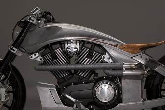
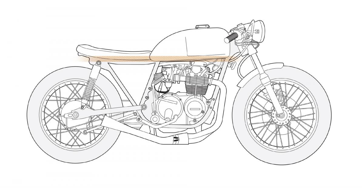 This build by David Browning of E3 Motorcycles makes the perfect template for discussing lines, including the one shown here, the foundation line. David K. Browning / E3
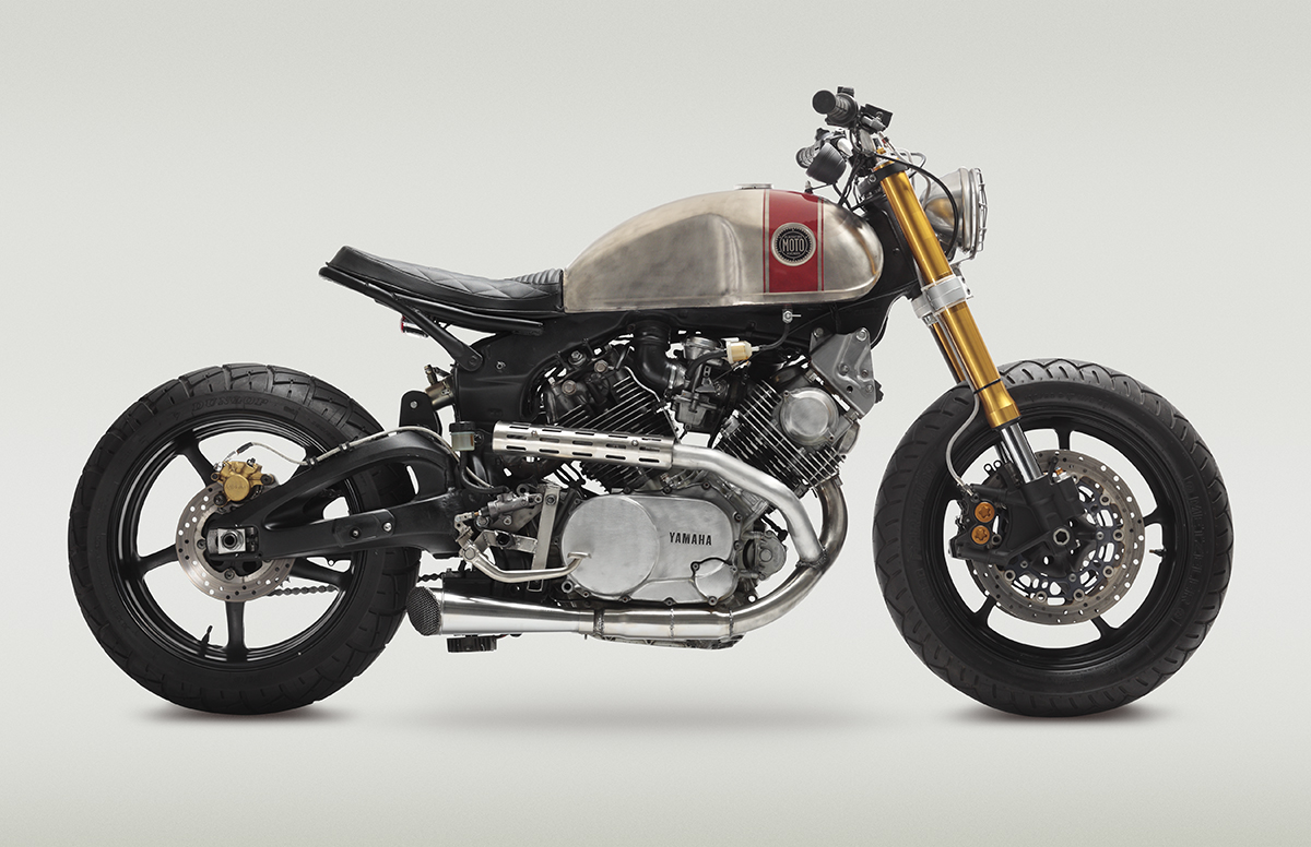 Classified Moto’s XV920-R6 features a stubby, short tail section that bends upward as It emerges from the fuel tank. This creates the feel of a bike that was built to go into battle. You’re going to jump on it with a shotgun in hand and ride one-handed while taking aim at the beasts behind you. Adam Ewing
2. Cutoff Points
The front and back of a bike are not so much determined by its outermost edges, but rather by the points at which the bulk of its parts begin and end. These points can, at times, determine whether a bike looks silly and accidental or deliberate and considered.
Decisions regarding cutoff points contribute to the balance of a design (or its lack of balance). It’s also vital to make all of these decisions look purposeful. In design, a slight inconsistency can appear to be a mistake rather than a decision. If two lines run parallel to each other, for example, and a third runs, say, a couple of degrees off from the first two, anyone looking at the trio will think it was the result of poor workmanship. If, however, the third line is a solid 20 degrees or so different, the brain sees it has having been done on purpose. This can be the difference between a bike that looks accidental and one that looks considered.
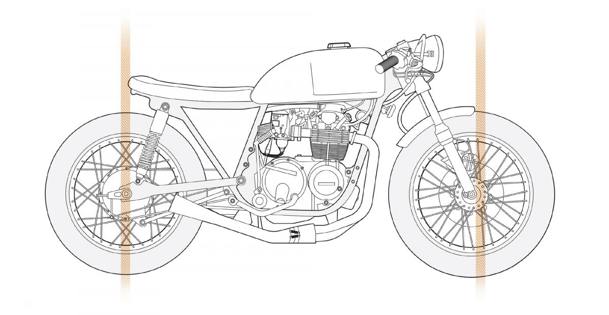 At the back end, the seat sticks out just far enough to line up with the rear axle. At the front, the fender stops abruptly in line with the front axle. The matching cutoff points give the bike a harmonious, balanced look. David K. Browning / E3
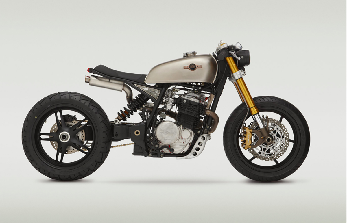 On a technical note, Alan Stulberg points out, it’s important to consider whether or not the tire might hit the tail if the bike bottoms out during a hard ride. If a tail hoop ends directly over the rear tire, the tire can touch it. For this reason tail sections of this length usually curve upward. Making the tail longer or shorter, to end before the tire or after it, can eliminate this problem. Another option is to increase the gap between the top of the tire and the frame’s tail so that a bottomed-out tire sill will not reach it. Adam Ewing
3. Height
There are two types of height to consider in motorcycle design: the overall height of the bike, which affects the rider, and the bike’s height limit, a design choice that refers to the tallest point of the bike’s profile. You need not adhere to any type of rule here—again, this is all about doing what you want—but it’s worth understanding how these decisions affect the stance of a bike and its rider.
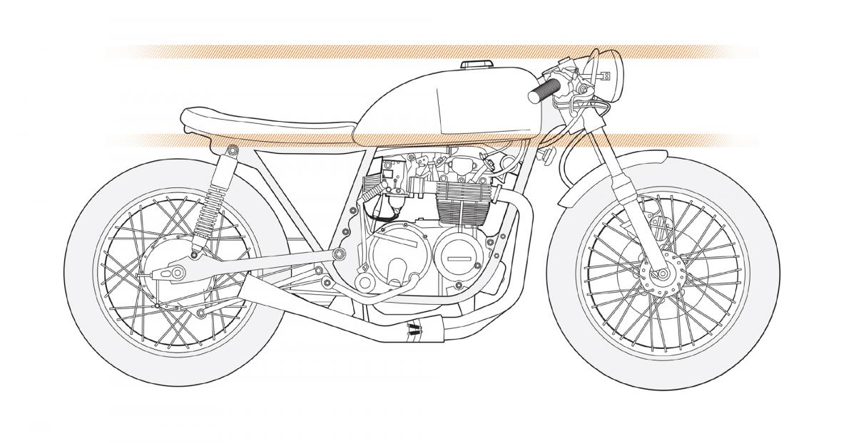 This bike’s seat height and total height aren’t too far off from each other. The effect is a bike that looks flat and fast, as opposed to, say a chopper, whose ape-hanger bars could be two feet taller than the tank, creating a more reclined look. David K. Browning / E3
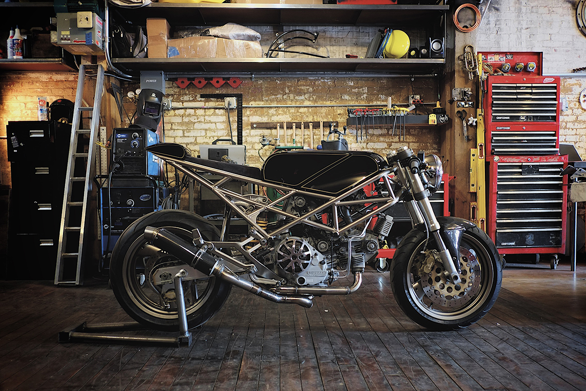 While the height limit of Hazan’s Ducati is consistent from the front end through the fuel tank, the tail pokes out a little aboive it, which accentuates the downward angle of the rear frame line. David K. Browning / E3
4. Visual Weight
“Visual weight” describes how a bike’s density is distributed. To understand this, consider which parts of a motorcycle allow you to see through to the other side of it. Spoke wheels, for example, have very little visual weight. They’re light and airy. They feel transparent. The motor, on the other hand, is quite dense. There may be a few small open spaces around it, but the engine itself is a solid block of metal. The denser an area, the heavier its visual weight. Generally, the lightest areas of a bike—it’s most open areas—are at the front and back.
The heaviest visual weight of many, if not most, bikes tends to occur just ahead of its horizontal center because this is where the engine sits. This is often true even when other areas of the bike are covered by plastic, such as on a modern sport bike or a scooter. While the plastic creates a solid area and, therefore, the illusion of substance, the engine’s material—solid steel—always feels heavier. On other bikes, the weight can be more evenly distributed. In either case, the position of the weight affects its appearance and even the style it falls closest to.
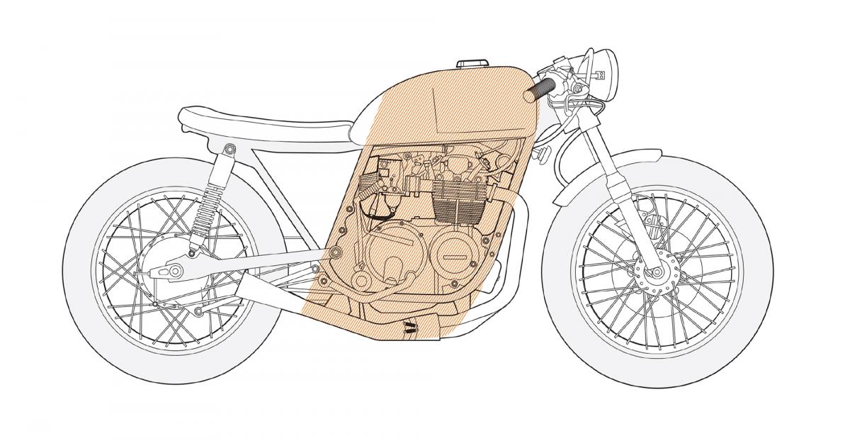 That triangle of open space behind the engine is a common sight in custom motorcycle design (it comes from removing the airbox, relocating the electronics, and crafting amore minimal seat). Even the the bike as a whole now looks lighter, the visual weight of the engine is even more pronounced. David K. Browning / E3
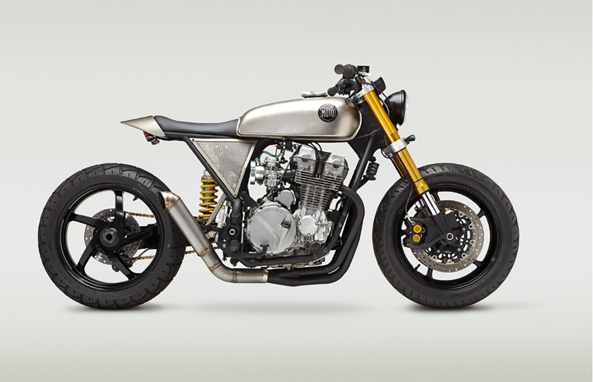 If you simply don’t have much flexibility with your lines, you can work around by drawing attention to other things. Look at a few Callsified [Moto] bikes and you’ll notice the frequent use of mesh-metal side covers.”Get creative with covers and shields,” says Ryland, “to distract the eye from things that might conflict with angles you are working with.” Adam Ewing
5. Bone Line
The bone line, as described in the beginning of this chapter by Charlie Trelogan, is the physical center of the vehicle, where the reflection will fall. Trelogan was careful not to over-apply this term to motorcycle design in general, but for the sake, once again, of building a language with which to talk and think about motorcycle design, this term might be useful. Looking at a bike and deciding whether or not you like it is one thing. Understanding how to create what you like is an altogether more complicated task, so forcing yourself to see a bike in terms of lines and shapes has value regardless of the accuracy of the terminology.
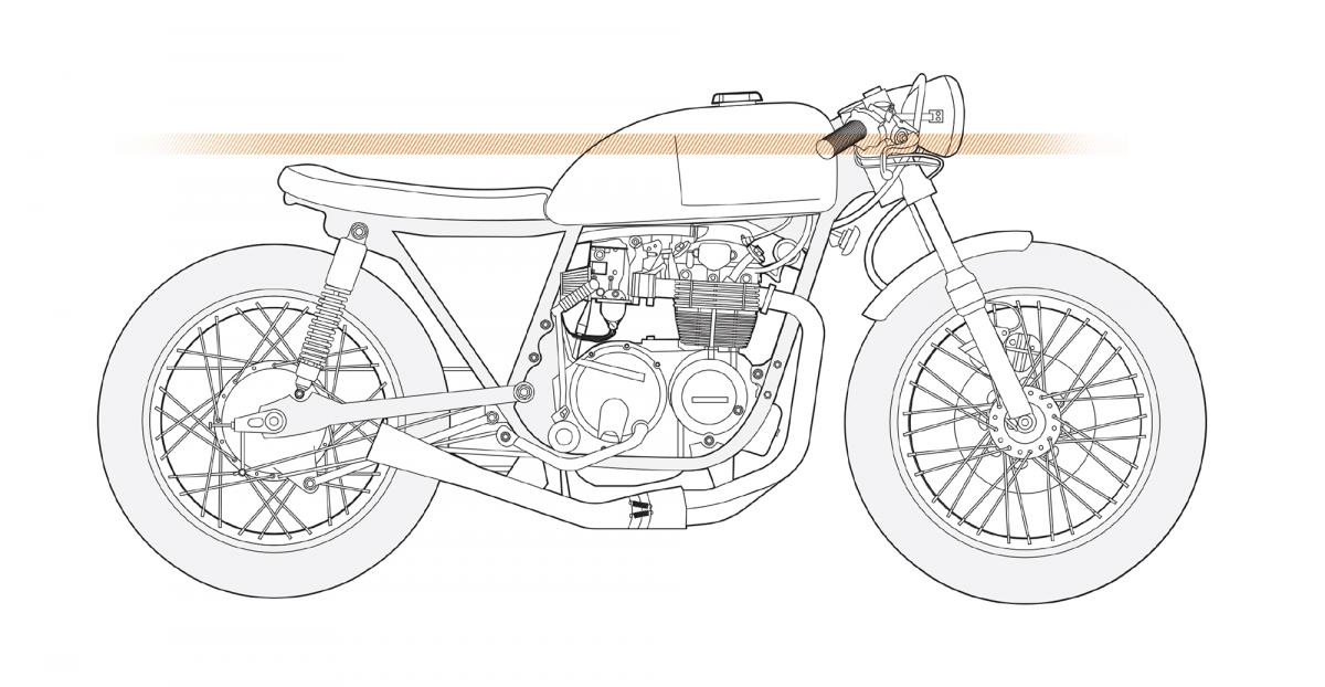 You can practically draw a straight line from one end of this bike’s bone line to the other. Note how the reflections form a straight line from front to back. David K. Browning / E3
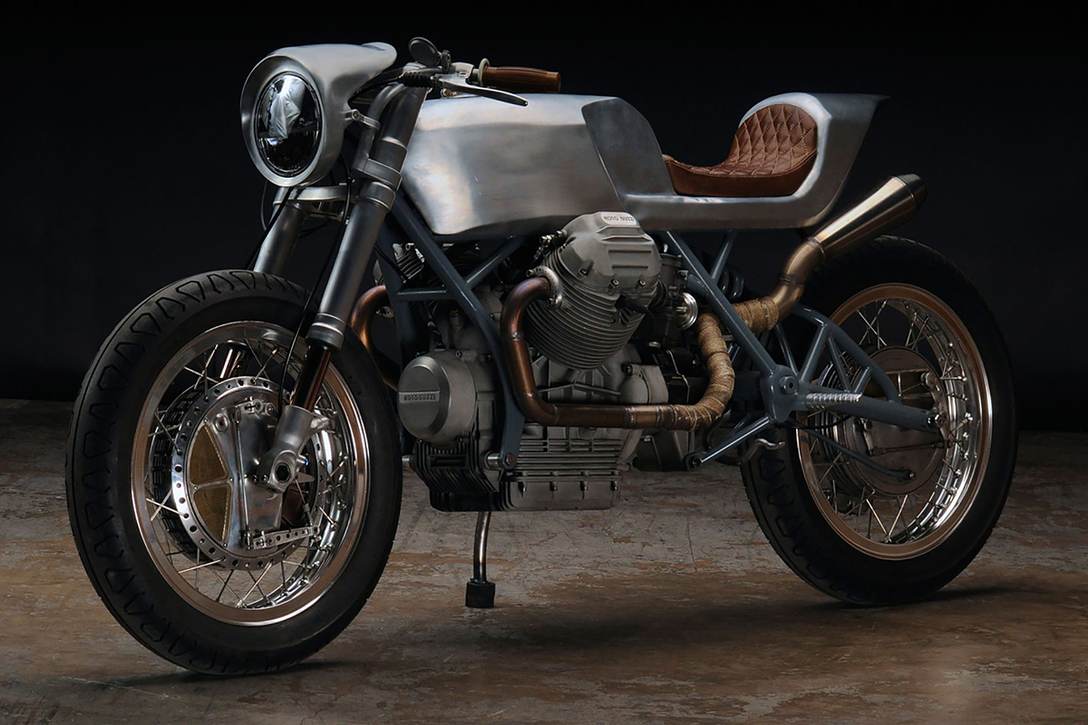 A clear bone line is one great effect of Revival Cycle’s tendency to match the tail to the tank. Alan Stulberg
6. Primary Lines
A bike’s primary lines, for the sake of picking apart a design, are those which are most dominant after the foundation line. On any bike, there may be just a couple of them, or even just one. Even when there are multiple strong lines, they may not match. They may not have anything to do with each other. But if you do have strong lines on your bike, it can be good to consider how they match or mismatch other lines, and how all of the lines connect and relate to each other.
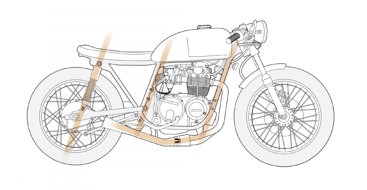 This not how Charlie Telogan defined it in his Bike EXIF post, but for the sake of expflanation, think of the primary lines as those that stand out the most. Here’ it’s the three matching lines formed by the frame and shocks, and the exhaust which stands out in contrast to them. David K. Browning / E3
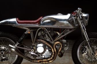
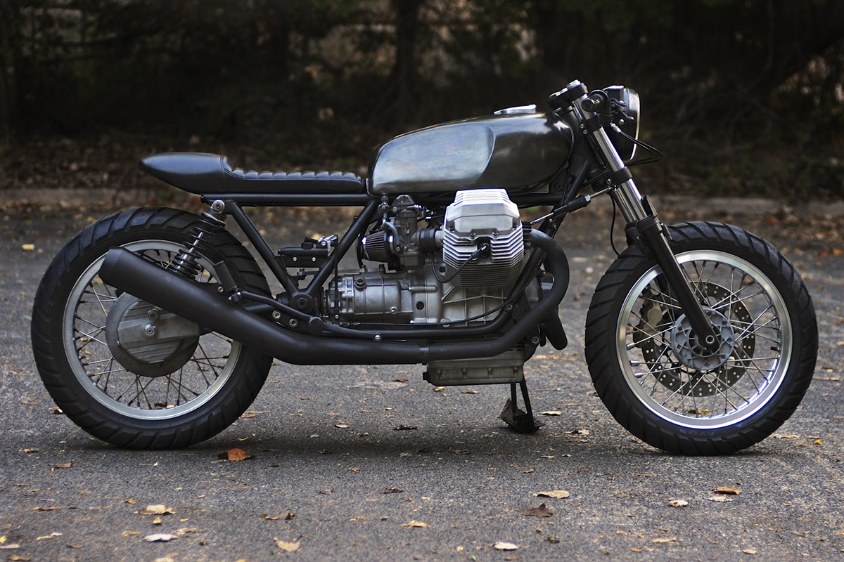 Le Mans IV by Revival Cycles. Alan Stulberg
7. Secondary / Contrasting Lines
To make something pop on a motorcycle, you first create symmetry, balance, and consistency (you’ll notice this in other details as well, in later chapters), and then you break away from it. Two or more matching lines make a contrasting line stand out. The conflict creates drama. And drama is where your bike’s stance really shines. With enough intention and willingness to experiment, and you can end up with a symphony of lines that all work together to create small moments of beauty within a wall of details.
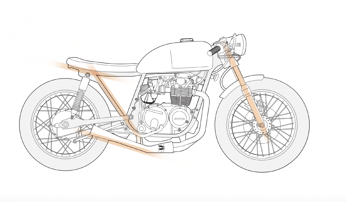 You can think of “secondary lines” as supporting actors–they’re a little less dominant and often contrast with a bike’s primary lines. Exhaust can also fit into this category. David K. Browning / E3
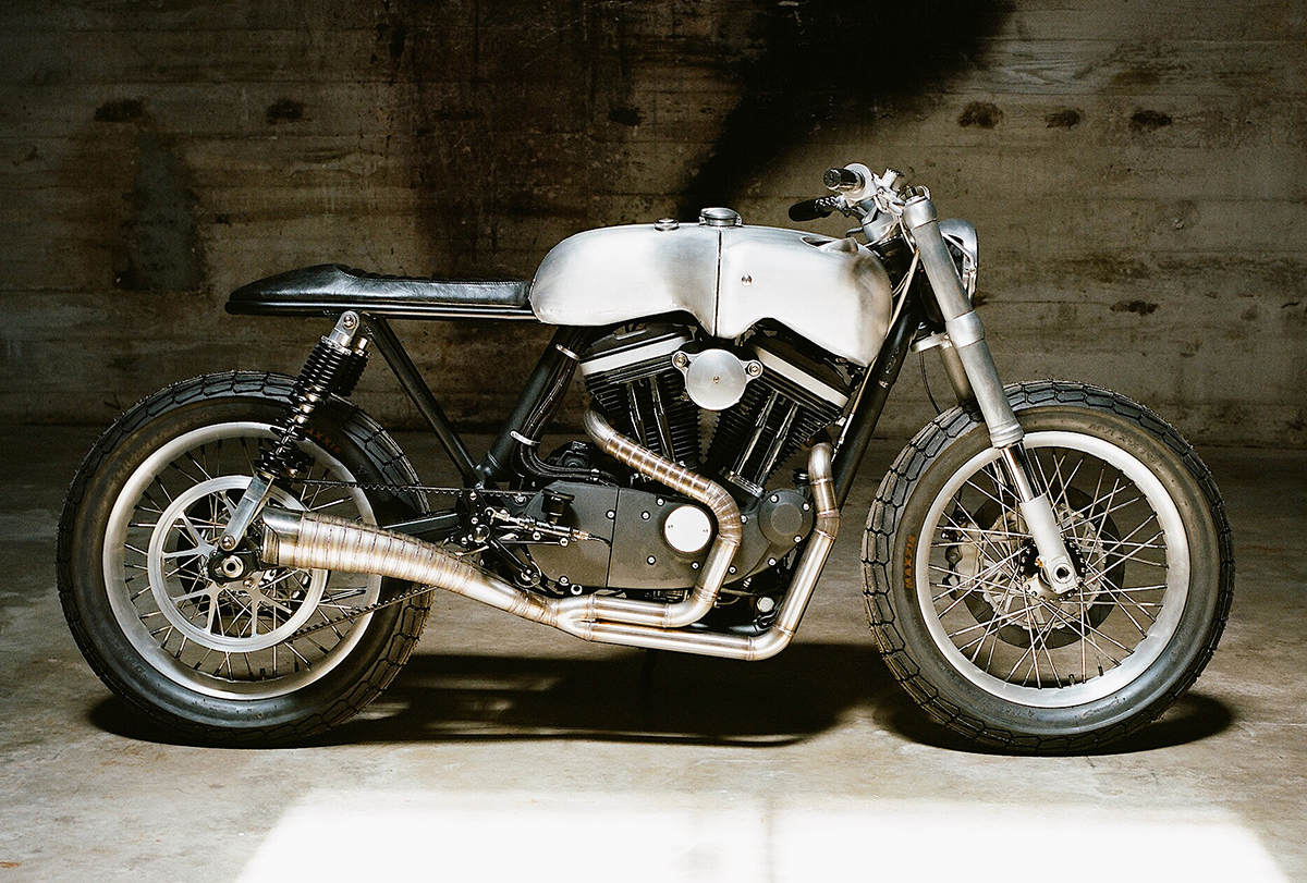 There are a lot of great things going for Revival Cycles’ Hardley (a 2010 Harley-Davidson Sportster), not the least of which is the handcrafted exhaust, the lines of whch work both with and perfectly agains lines elsewhere on the bike. Alan Stulberg
8. Fork Distance / Rake
Rake is the angle of the front forks relative to a vertical line. It determines where the front wheel lands. It can significantly affect not only the look of your bike, but how it handles when you get it on the road. There’s a big divide between a shallow fork rake and a broad one—much bigger than the foot or so difference in the position of the front wheel.
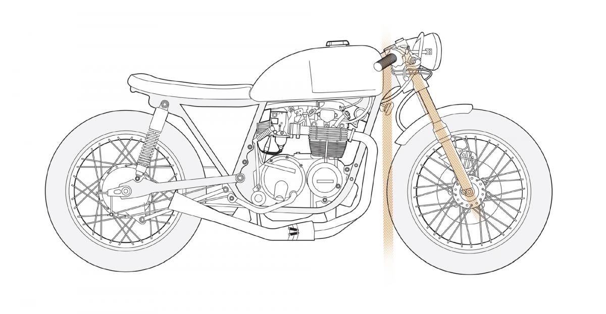 A narrower rake like this makes for better cornering. With the broad rake of a chopper, you might be better off avoiding corners entirely. David K. Browning / E3
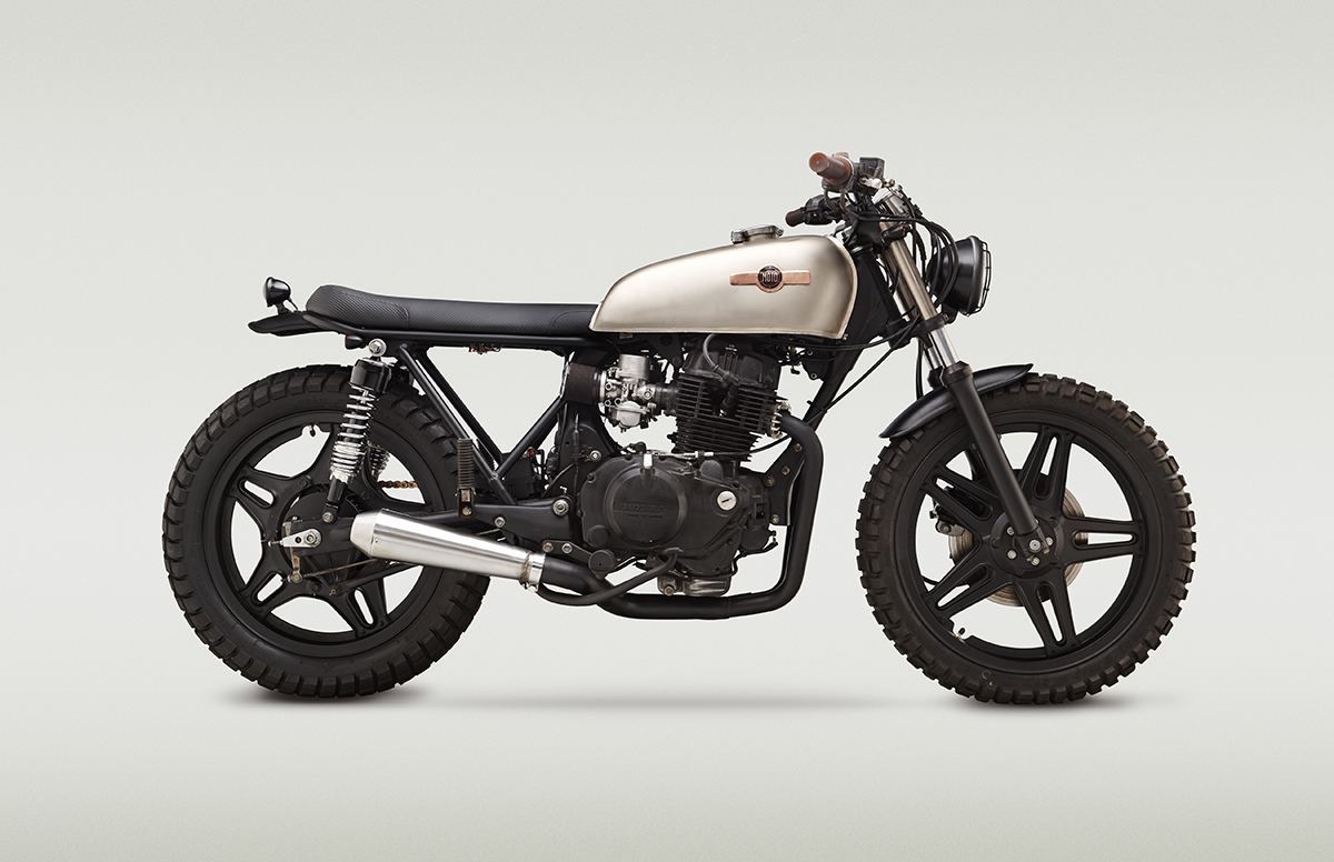 Classified keeps their rakes mostly in stock form, but often lowers the front end a bit, resulting in an aggressive, forward-leaning stance. Adam Ewing
THE LINES
This section is loosely based on a wildly popular BikeEXIF.com feature post, “How to Build a Café Racer,” written by guest contributor Charlie Trelogan, a car designer by profession. Some of the terms used in this chapter came from him and represent the kinds of lines he sees in motorcycle design. It’s vital to note, however, that they are not concepts necessarily meant to guide motorcycle design. Rather, they are terms used here to describe motorcycle design that has been done before. They’re repurposed here to help you see bikes differently and to create a language you can use to make sense of the things you see when you look at a motorcycle.
With all that in mind, some of Trelogan’s terms do offer a nice framework you can use to break down the various shapes and patterns of a motorcycle’s aesthetic while working on your own. To that end, here are some things to think about while you’re choosing your outfit for the road.
1. Foundation Line
The foundation line is the main line that runs from one end of the bike to the other (mostly) and serves as a sort of equator for the bike. It’s what the brain sees as the most significant and defining line of the bike, even if almost nothing else goes along with it. It can be dead straight, curved like a tilde (~), slope up or down, dip down, arch up, or any combination of those things. Somewhere in that beautiful mess of parts, a dominant line sets the tone for everything else. It may not be blatant—it may even be disguised by other parts, such as side panels—but if you stand back and look at the dominant shape of a bike as if it’s a stick figure, you should be able to see the imaginary line dictating its overall shape.
“I like it when a bike sits like its ready for action,” says John Ryland. “To me, action means fighting your way out of the city in the zombie apocalypse. To others, it might mean dragging an elbow at Laguna Seca, or getting thirty feet of air. That’s where the design choices come in.”
 This build by David Browning of E3 Motorcycles makes the perfect template for discussing lines, including the one shown here, the foundation line. David K. Browning / E3
 Classified Moto’s XV920-R6 features a stubby, short tail section that bends upward as It emerges from the fuel tank. This creates the feel of a bike that was built to go into battle. You’re going to jump on it with a shotgun in hand and ride one-handed while taking aim at the beasts behind you. Adam Ewing
2. Cutoff Points
The front and back of a bike are not so much determined by its outermost edges, but rather by the points at which the bulk of its parts begin and end. These points can, at times, determine whether a bike looks silly and accidental or deliberate and considered.
Decisions regarding cutoff points contribute to the balance of a design (or its lack of balance). It’s also vital to make all of these decisions look purposeful. In design, a slight inconsistency can appear to be a mistake rather than a decision. If two lines run parallel to each other, for example, and a third runs, say, a couple of degrees off from the first two, anyone looking at the trio will think it was the result of poor workmanship. If, however, the third line is a solid 20 degrees or so different, the brain sees it has having been done on purpose. This can be the difference between a bike that looks accidental and one that looks considered.
 At the back end, the seat sticks out just far enough to line up with the rear axle. At the front, the fender stops abruptly in line with the front axle. The matching cutoff points give the bike a harmonious, balanced look. David K. Browning / E3
 On a technical note, Alan Stulberg points out, it’s important to consider whether or not the tire might hit the tail if the bike bottoms out during a hard ride. If a tail hoop ends directly over the rear tire, the tire can touch it. For this reason tail sections of this length usually curve upward. Making the tail longer or shorter, to end before the tire or after it, can eliminate this problem. Another option is to increase the gap between the top of the tire and the frame’s tail so that a bottomed-out tire sill will not reach it. Adam Ewing
3. Height
There are two types of height to consider in motorcycle design: the overall height of the bike, which affects the rider, and the bike’s height limit, a design choice that refers to the tallest point of the bike’s profile. You need not adhere to any type of rule here—again, this is all about doing what you want—but it’s worth understanding how these decisions affect the stance of a bike and its rider.
 This bike’s seat height and total height aren’t too far off from each other. The effect is a bike that looks flat and fast, as opposed to, say a chopper, whose ape-hanger bars could be two feet taller than the tank, creating a more reclined look. David K. Browning / E3
 While the height limit of Hazan’s Ducati is consistent from the front end through the fuel tank, the tail pokes out a little aboive it, which accentuates the downward angle of the rear frame line. David K. Browning / E3
4. Visual Weight
“Visual weight” describes how a bike’s density is distributed. To understand this, consider which parts of a motorcycle allow you to see through to the other side of it. Spoke wheels, for example, have very little visual weight. They’re light and airy. They feel transparent. The motor, on the other hand, is quite dense. There may be a few small open spaces around it, but the engine itself is a solid block of metal. The denser an area, the heavier its visual weight. Generally, the lightest areas of a bike—it’s most open areas—are at the front and back.
The heaviest visual weight of many, if not most, bikes tends to occur just ahead of its horizontal center because this is where the engine sits. This is often true even when other areas of the bike are covered by plastic, such as on a modern sport bike or a scooter. While the plastic creates a solid area and, therefore, the illusion of substance, the engine’s material—solid steel—always feels heavier. On other bikes, the weight can be more evenly distributed. In either case, the position of the weight affects its appearance and even the style it falls closest to.
 That triangle of open space behind the engine is a common sight in custom motorcycle design (it comes from removing the airbox, relocating the electronics, and crafting amore minimal seat). Even the the bike as a whole now looks lighter, the visual weight of the engine is even more pronounced. David K. Browning / E3
 If you simply don’t have much flexibility with your lines, you can work around by drawing attention to other things. Look at a few Callsified [Moto] bikes and you’ll notice the frequent use of mesh-metal side covers.”Get creative with covers and shields,” says Ryland, “to distract the eye from things that might conflict with angles you are working with.” Adam Ewing
5. Bone Line
The bone line, as described in the beginning of this chapter by Charlie Trelogan, is the physical center of the vehicle, where the reflection will fall. Trelogan was careful not to over-apply this term to motorcycle design in general, but for the sake, once again, of building a language with which to talk and think about motorcycle design, this term might be useful. Looking at a bike and deciding whether or not you like it is one thing. Understanding how to create what you like is an altogether more complicated task, so forcing yourself to see a bike in terms of lines and shapes has value regardless of the accuracy of the terminology.
 You can practically draw a straight line from one end of this bike’s bone line to the other. Note how the reflections form a straight line from front to back. David K. Browning / E3
 A clear bone line is one great effect of Revival Cycle’s tendency to match the tail to the tank. Alan Stulberg
6. Primary Lines
A bike’s primary lines, for the sake of picking apart a design, are those which are most dominant after the foundation line. On any bike, there may be just a couple of them, or even just one. Even when there are multiple strong lines, they may not match. They may not have anything to do with each other. But if you do have strong lines on your bike, it can be good to consider how they match or mismatch other lines, and how all of the lines connect and relate to each other.
 This not how Charlie Telogan defined it in his Bike EXIF post, but for the sake of expflanation, think of the primary lines as those that stand out the most. Here’ it’s the three matching lines formed by the frame and shocks, and the exhaust which stands out in contrast to them. David K. Browning / E3
 Le Mans IV by Revival Cycles. Alan Stulberg
7. Secondary / Contrasting Lines
To make something pop on a motorcycle, you first create symmetry, balance, and consistency (you’ll notice this in other details as well, in later chapters), and then you break away from it. Two or more matching lines make a contrasting line stand out. The conflict creates drama. And drama is where your bike’s stance really shines. With enough intention and willingness to experiment, and you can end up with a symphony of lines that all work together to create small moments of beauty within a wall of details.
 You can think of “secondary lines” as supporting actors–they’re a little less dominant and often contrast with a bike’s primary lines. Exhaust can also fit into this category. David K. Browning / E3
 There are a lot of great things going for Revival Cycles’ Hardley (a 2010 Harley-Davidson Sportster), not the least of which is the handcrafted exhaust, the lines of whch work both with and perfectly agains lines elsewhere on the bike. Alan Stulberg
8. Fork Distance / Rake
Rake is the angle of the front forks relative to a vertical line. It determines where the front wheel lands. It can significantly affect not only the look of your bike, but how it handles when you get it on the road. There’s a big divide between a shallow fork rake and a broad one—much bigger than the foot or so difference in the position of the front wheel.
 A narrower rake like this makes for better cornering. With the broad rake of a chopper, you might be better off avoiding corners entirely. David K. Browning / E3
 Classified keeps their rakes mostly in stock form, but often lowers the front end a bit, resulting in an aggressive, forward-leaning stance. Adam Ewing

